Logo Assignment
|
|
|
|
|
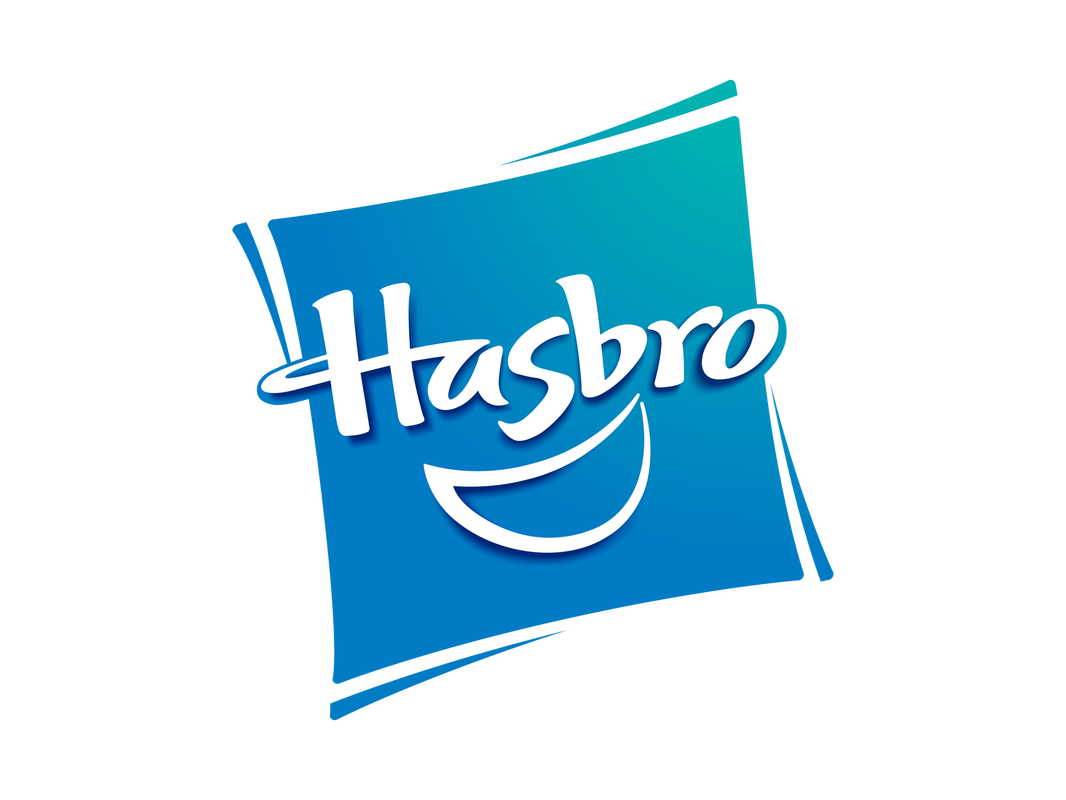
The Hasbro logo looks ok. I like the colours because blue and white really blend well together. However I don't like how simple this logo is.
|
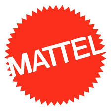
The Mattel logo looks to simple as well. It is just a pointy circle with the company written on it.
|
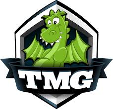
I reallly like this logo because the dragon looks really cool. I like how surronding the dragon is a border and I like the way how the intials of the company is written.
|
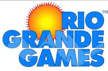
This logo is simple as well although the colours do look well together. The logo may be simple but I feel like it work well.
|
|
|
|
|
|
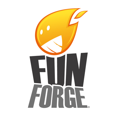
I really like this logo for the fact that the name of the company relates to the logo. I like how they made the flame happy since this clearly repersents the company name.
|
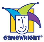
This logo is pretty good I like how there are many different colours compared to most logos. I like how the face is happy and crazy.
|
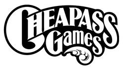
Again this is a simple logo however it works realy well becaus ethe font looks really nice and the way the letters are postioned.
|
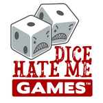
Ilove how this logo how the dies are angry it repersents the company really well. It looks really good how the letters seem to be stamped on.
|
|
|
|
I dislike this logo because I don't think the colours go well together and it kind of looks old. It seems boring and not unique and the colours don't look really well espicially the yellow.
|
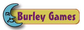
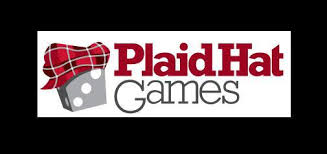
This logo is very intersting I like how the dice is wearing a plaid hat. I like how they made the key words in red I like how the red makes the word stands out.
|
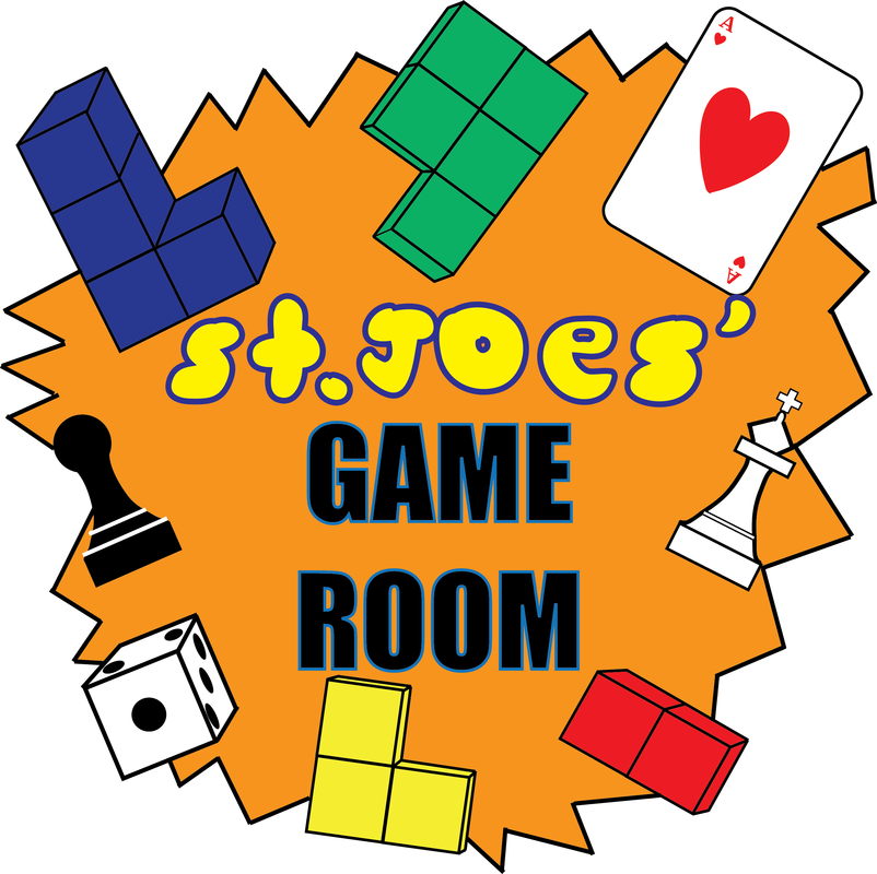
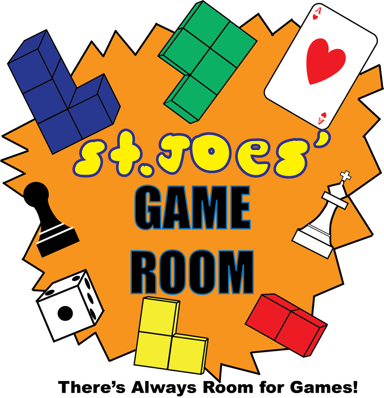
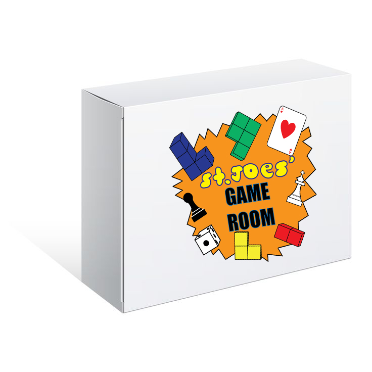
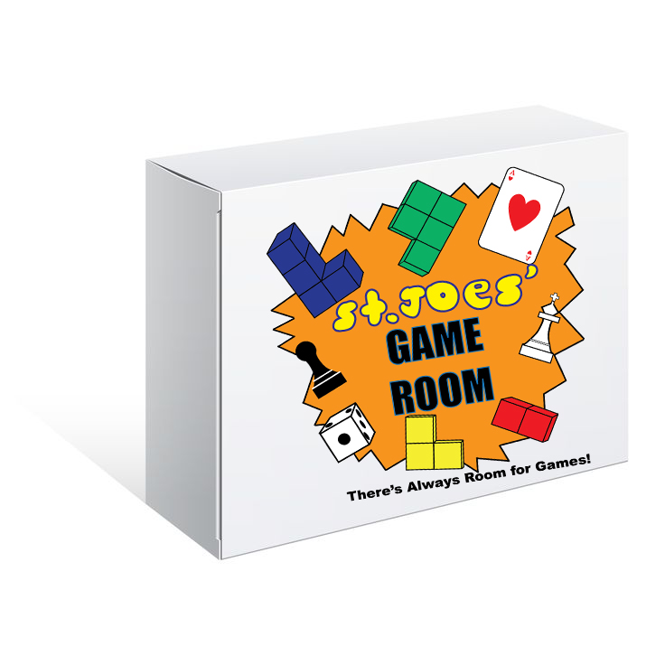
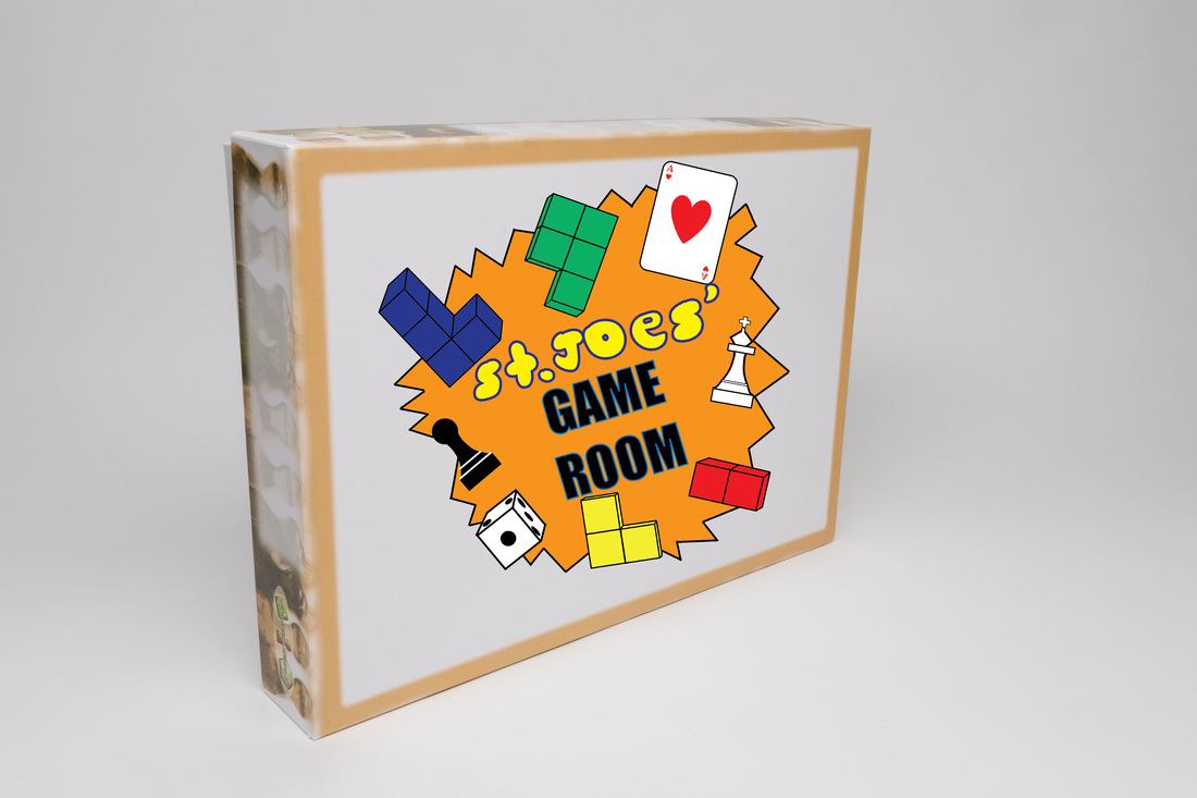
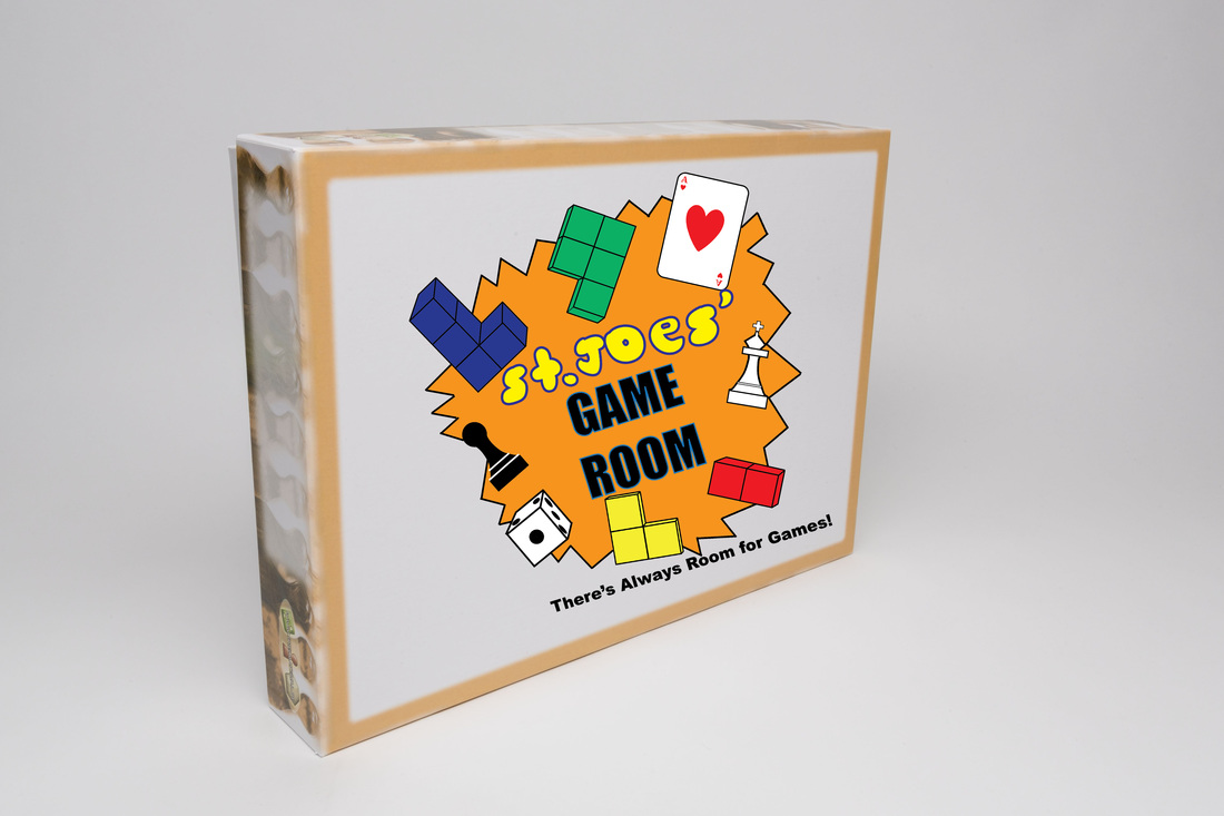
For the logo assignment I chose to do a logo for the Game Room that we have at school. The companies that are siiliar to my logo are different game board companies.
My Logo
|
|
|
|
|
|
Creative Brief Worksheet
I think the first “Bank of America” logo is more appropriate because the font is more solid and professional. Since the logo is for the bank a more professional logo would be better because a bank is a professional organization who is more targeted for adults. The second logo doesn’t necessarily represent an American bank because it just has stars while the other one is a better representation because it has a representation of the American flag. Knowing your clients and the services they provide will guide your decision because some logos will appeal more to children if they are colourful. While for adults the logo would be more serious and professional.
Project Summary
What type of product or service do you offer?
The product/ service that I offer is at lunch time students and teachers can play a variety of games in the Game Room. It gives both students and teachers something to do at lunch.
How long have you been in business?
I have been part of the Game Room from where it first opened which was last year so I have been in busniess for 2 years now.
What do you hope to accomplish with your new identity?
I am hoping that more students and teachers will join the Game Room at lunch.
What are your long-term goals?
My long-term goals are to get more games and people to join the game room. Especially expanding the amount of games in the game room and members as well.
Audience Profile
Please describe your existing audience.
My existing audience is some teachers, grade 10s and 11s students of St.Joe's.
Who would you like to add to your audience?
I would like to add grade 9s and 12s to the gameroom and more teachers as well.
Perception/ Tone/ Guidelines
Do you have any colours in mind for your logo?
The colour I have in mind for my logo is blue and yellow because those are the colours of St.Joes and the logo is for St.Joe's Game Room.
Do you have any specific images or icons in mind that you would definitely like to see incorporated into your logos?
Yes I would like to see a variety of different game pieces from the game room like cards and dies.
Communication Strategy
What is your tagline or slogan?
My tagline or slogan is “There is always room for games.
What is your overall message you are trying to convey to your target audience?
My overall message that I am trying to convey my target audience is that they should come to the game room at lunch and play different games.
Where will your new logo be used?
My new logo will be used on a sign on the door to the game room.
Competitive Positioning
What are your competitors and what do you think about their logos?
I don’t really have any competitors because it is a logo for the St.Joe's Game Room. The only competition would most likely be other teams or clubs and I am unsure what their logos are. The competitors that I decided to use is other board game companies. I feel that most of their logos are too simple. I feel like their logos are not too colorful and they don’t really stand out too much.
List the competitive URLS if possible.
Hasbro- http://www.hasbro.com/en-ca
Mattel- http://www.mattel.com/
TMG- http://playtmg.com/
Rio Grande Game- http://riograndegames.com/
Fun Forge- http://www.funforge.fr/US/
GameWright- http://www.gamewright.com/gwintro.html
Cheapass Games- http://www.cheapass.com/
Dice Hate Me Games- https://greaterthangames.com/games/dice-hate-me-games
Burley Games- http://www.burleygames.com/
Plaid Hat Games- http://www.plaidhatgames.com/
What sets you apart from your competitors?
The fact that my logo is more complicated than most of my competitors and uses a variety of colours as well.
Targeted Message
State a single-minded word or phrase that will appropriately describe your company.
A single minded word that will appropriately describe my company is games.
